holiday card favorites

After a long hiatus, I’m back to share some of my favorite holiday cards. I’m especially fond of folded cards, and I’m not talking about a standard side-fold card! I love a good z-fold or wallet card, especially when dealing with multiple photos and/or text. The first example is from the 2021 new year. I’d been doing this client’s cards since her boys were young, and all the sudden they were grown up and graduating from high school! We created a stunning final holiday card featuring her boys’ kindergarten photo next to their senior photo, and well wishes as they venture into college life. I’m kind of sad to see it come full circle, but it was a wonderful ride!

Front panel of new year’s card with textured background.

View of card from above showing z-fold format.

Next up is a christmas card from several years ago that stands out as a favorite. I adore working with this client every year to come up with something unique. It was difficult to decide on photos of her girls, so we used all three! The wallet format allows printing on the front panel, and immediately on the right when you first open. As you continue to open the final flap you have a gallery of all three photos. The card size is small and intimate, and tone on tone printing adds an elegant touch. It’s perfection!

view from above of wallet fold card with printing on front, and three photos mounted inside.

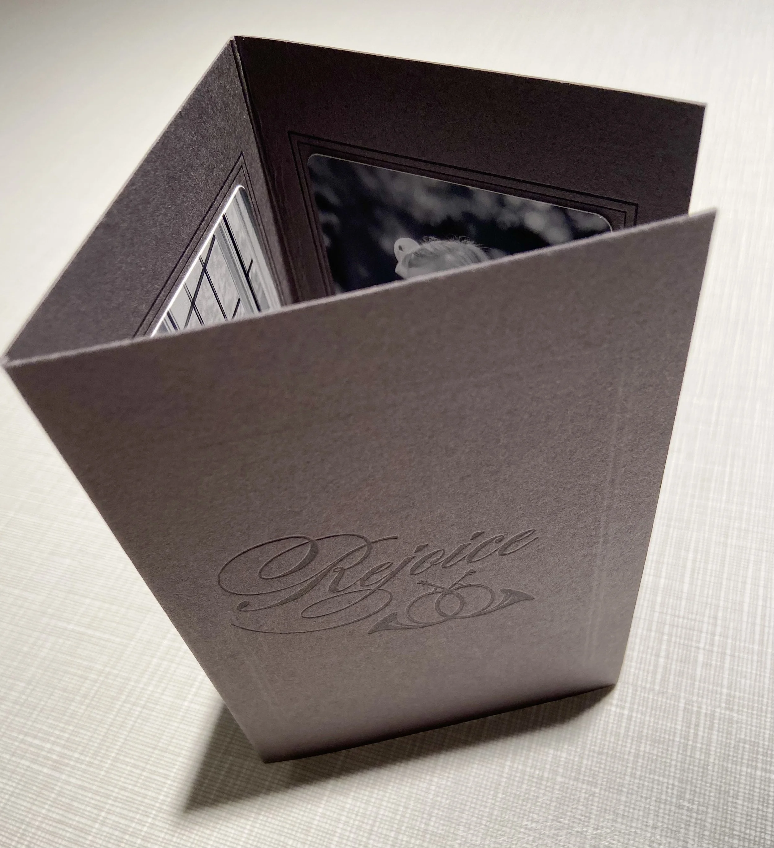
The last example is from the 2021 holiday season and is another z-fold card. I love the simplicity and clean lines of this design. I wanted the b/w photography to stand out, so kept it simple. My client wanted to feature her animals on the card this year in a separate photo, so we decided to do a folded style.

Small square z-fold card featuring two photos and clean text.

When you’ve been creating cards for clients as long as I have, it can get tricky to introduce something new and different. You can certainly get into a rut! I encourage clients to switch it up each year, whether it’s doing a folded card instead of a flat one, or color instead of b/w (that goes for photos too). Have fun with it!

a few of my favorite things...

It’s really hard to pick favorite projects when you’ve been printing almost 20 years, but I do have a few that stand out that I’d like to share.

I’ve worked with Mimi Brown of Mimi Brown Studio in NYC on several jobs over the years. One of those jobs was the menu and place cards for a surprise birthday dinner for Gwyneth Paltrow. Mimi had the location and theme worked out, so we started brainstorming design ideas. We actually produced two versions of the menu and ultimately went with the one pictured here. It was a small square z-fold with matte silver printing. The coordinating place cards were printed on a double-thick paper with the same branch motif. Jan Pruitt of Jan Pruitt Calligraphy hand-penned each attendee’s name on the cards. The end result was stunning!

Menu and place card for Gwyneth Paltrow’s birthday dinner.

Menu and place card for Gwyneth Paltrow’s birthday dinner.

Another event planner I’ve worked with for years is Eddie Tackett in Dothan, AL. He’s a joy to work with and has a great eye for design. He planned both weddings for Nick and Terry Saban’s children and I was honored to take part. Among the items I created, the wedding programs for both are my favorites. I outsourced the engraving for the gold monograms on the front, ordered custom dyed silk ribbon from CA, and Jan Pruitt’s calligraphy was incorporated into the inside pages. They are such beautiful keepsakes.

Wedding programs for Nicholas Saban (left) and Kristen Saban (right).

Wedding programs for Nicholas Saban (left) and Kristen Saban (right).

Another project that stands out was a rehearsal dinner invitation for Cindy Rhoden. Cindy is full of creativity, and loves the unexpected. She and her husband Ken recently ventured into event planning by restoring and opening an event space called The Theodore. Be sure to check it out here.

We decided to go with invitations that were individually hand-dipped into sea blue watercolor baths. No two are alike! Jan Pruitt penned the names and we printed on handmade deckled edge paper from Spain. It all came together perfectly.

Hand-dipped watercolor invitations on spanish deckled edge paper, featuring hand calligraphy for names.

Hand-dipped watercolor invitations on spanish deckled edge paper, featuring hand calligraphy for names.

There are many more favorites, and I’ll be featuring them in future posts. I’ll also devote a post to “challenging projects” - you know, the ones that don’t go as planned and how I navigated through them. I found out there’s always a solution! Until then, feel free to comment or ask questions below.

supplies + resources for your letterpress studio

The most essential thing you’ll need for your studio is a printing press. The question is, what kind of press do you want? The decision was easy for me since most of my experience was with Vandercook presses. I had disassembled/reassembled one during my MFA program, so felt very comfortable with refurbishing one. Vandercook made many models and sizes while in production. Mine is a No. 4 and has a motorized drum roller which evenly distributes ink to the other rollers. Everything else is manual, so I hand crank and pull each piece. Some people prefer automated presses, such as a Heidelberg Windwill. I looked into one but decided it was not feasible with my set up. I would suggest researching all the different presses, reading as many reviews as possible, and decide what type works with your set up and experience level. As mentioned before, Briar Press is a wonderful resource for all things letterpress, so check it out.

Printing inks from various suppliers.

Printing inks from various suppliers.

Once you have a press, you will need some basic supplies to start printing. I would suggest a Pantone Formula Mixing Guide. Make sure it has the formulas to mix the colors. I have the matte guide since I primarily print on matte papers. You can purchase a scale to mix colors, but it’s very pricey. I have great success “eyeballing” color with the formula guide and you can get reasonably close. You can also order ink cans of custom PMS colors, but again, it will cost more. Speaking of inks, you’ll need all the basics. NA Graphics and Boxcar Press both sell inks, as does Letterpress Ink. I recommend rubber based inks for letterpress. Rubber based inks dry by absorbing into the paper, and they stay open on the press longer. Oil based inks air dry, so you don’t want to leave on the press for too long. I got so busy at holiday that I forgot to clean my press after a job, and remembered two days later. I was relieved it cleaned up without issue (thanks to rubber based ink). I would suggest getting the following colors: mixing black, transparent white, warm red, rubine red, blue 072, process blue, green and yellow. I reach for those the most. Then you can add on with additional colors later. You’ll also need a palette knife, pica ruler, palette pad, rags and solvent for clean up. I use odorless mineral spirits for my metal rollers, but use California wash on my composition rollers so they don’t break down.

Aluminum base with quoin/key and furniture to lock in place; photopolymer plate on base.

Aluminum base with quoin/key and furniture to lock in place; photopolymer plate on base.

For your printing press, you will need some furniture and quoins/keys. These are pieces of wood or metal to will be placed around your type form or printing base and then locked into place to prevent movement during printing. I use photopolymer plates with adhesive backing, which are mounted to an aluminum base that is type-high. This means the height of the plate is perfectly set so the rollers distribute ink only to the type/image on the plate. If you want to make sure your rollers are type high, you can check with a roller gauge (which are measured at .918”). Purchasing an aluminum base and gauge will set you back about $300. Furniture and quoins/keys can sometimes be found on ebay, or contacting a supplier directly. You will also need packing paper for your tympan to customize the impression of your plate. This can be purchased from NA Graphics.

Once you have all your basic supplies, you’ll need to order a printing plate and paper to print on. I use Boxcar Press in NY and they do a fantastic job. They have quick turnaround, good pricing and are easy to work with. Simply upload your b/w artwork and order. You can consult with them on what the best type of photopolymer is for your job, but I generally order the KF95 plates. They hold details well but still hold up to longer runs. There are a lot of options for paper. If you have a business license you can set up wholesale accounts with several vendors and order paper in bulk. Starting out though, you probably won’t need much so shop local or order on the web. When I’m in a pinch I go by my local Paper Source store. Otherwise I order from Announcement Converters (wholesale). They carry thousands of papers from all different mills.

So you’re finally ready to print? I’ll walk you through my checklist when processing a job. I start with a printout of the final proof. I make sure my paper is cut to the correct size, mix my ink with my color guide, set up my plate on the press and check my tympan packing is correct for the thickness of stock I’m printing on. I’ll then ink up my press, pull a proof, make any adjustments to position and make more proofs until it’s exactly where it’s supposed to be. Then I start cranking out the pieces. Once I’m set up I can print about 100 pieces in 20 minutes. I check-in on inking about every 20-25 pieces to make sure it’s looking good. If getting light, I add some more ink and distribute. Once my job is done, I clean off the plate and remove from the base. I pull my rollers off so I can clean them with my solvents (be sure to wear protective gloves).

I realize this is a very condensed snapshot of a print job, and not all jobs go smoothly. Be prepared for hiccups! Many times, I’ve been at press only to find a problem with the plate, or a typo on the plate that was missed by everyone’s eyes. There are definitely frustrations (like when my motor burned out mid-run), but you learn to be agile and create solutions. There’s always a fix! And there’s a great letterpress community out there to lend a hand, so utilize it. Below are links to several of the resources mentioned above. Feel free to leave a comment or question. My next post will feature some of my favorite pieces. Until then, happy printing!

Briar Press

NA Graphics

Boxcar Press